
Mark Wessler's Other Vintage Friday the 13th Poster
The one knock on the poster, however, is the use of the hockey mask in the background. Of course, the mask does not fit with the 1980 film at all since there was no hockey mask in the whodunit slasher.
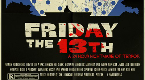
The original "vintage" poster was sold almost immediately following my story back in November, however Mark Wesler created a new variation on his original incarnation. Whereas his first Friday the 13th poster showcased the original logo font for the promotional title of the film, his newest version goes completely retro with the font for the title of the film. Mark also changed the original font of the tag line at the top of the poster to the more retro font styling.
Check out the posters below for the comparison and make sure to visit Mark's store to purchase yourself the retro goodness of Friday the 13th 1980!
 |
| First "vintage" poster that sold out in November 2010 |
 |
| Newest Version of the poster with retro font that is available in 11" x 17" |


I love this poster! I might just pick this up to hang in my room!
ReplyDeleteit makes no sense. the hockey mask had nothing to do with part one.
ReplyDeleteYep--I know the mask didn't show up until part 3, but I added it anyway. I knew fans of the first movie wouldn't like it, but I never expected these to become as popular as they have. I first started doing these posters for a local horror convention and figured folks would want something with Jason on it so I did this. Never really put much thought into them continuing after the show but people really seemed to dig them. As much as I love the original logos, I was told that was a no-no so I had to alter all my posters, thus this new version. I may go back and redo this one some day to more accurately represent the film rather than the franchise as a whole. I'm glad some people like it! Those that don't, I totally understand. Thanks!
ReplyDeleteNo worries, Mark. It's an awesome poster. And it makes sense about having to change the title and fonts due to rights issues. Thanks for stopping by!
ReplyDelete